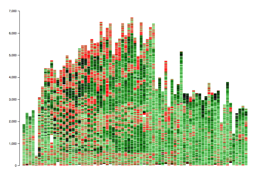
visualizing GPX runlogs
16 Oct 2014 A few month ago I started running with the Zombies, Run! 5k Training app. The data from the app is synced with the webservice and online you can see a few graphs which are quite ok, but I wanted a bit more than that.
You can download a GPX-File from every run, but there is no way to download an archive. So I scraped the logs from the "Zombies, Run!"-backend using their REST API.
GPX parsing is done with gpxpy. Since the app produces GPX 1.1 files, the 1.1-branch is used. Datetime parsing is a bit broken in gpxpy (at least for dates with timezone), dateutil fixes that. The stacked bar chart is created with D3.js, which means much more fun than gnuplot.
Red areas represent walking, green are above the running speed threshold.
Source code is available on github.